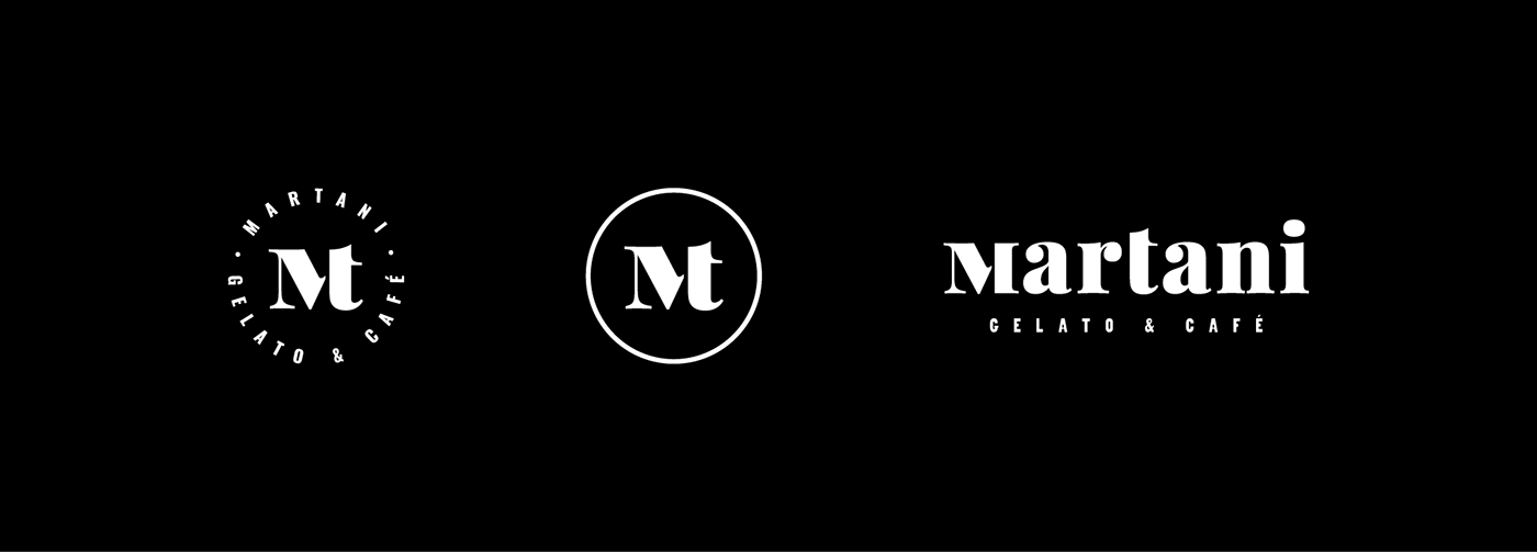
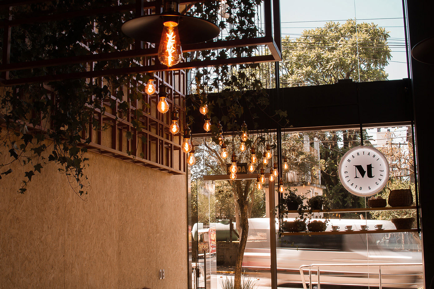
martani
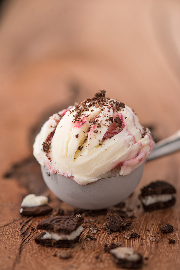
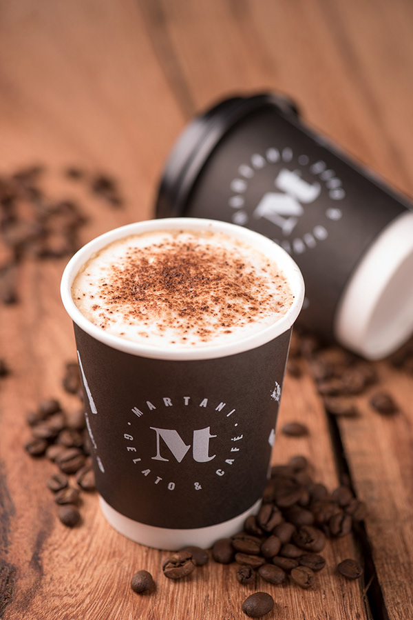
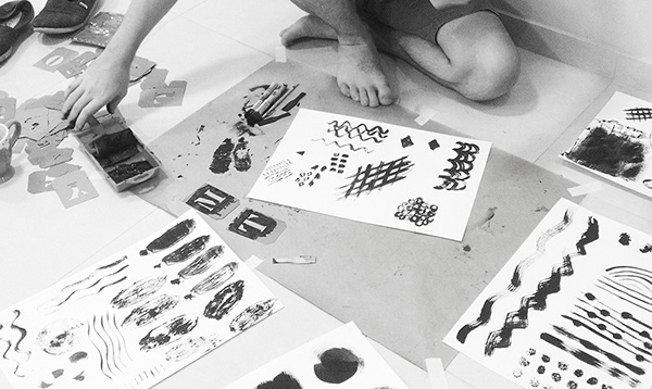
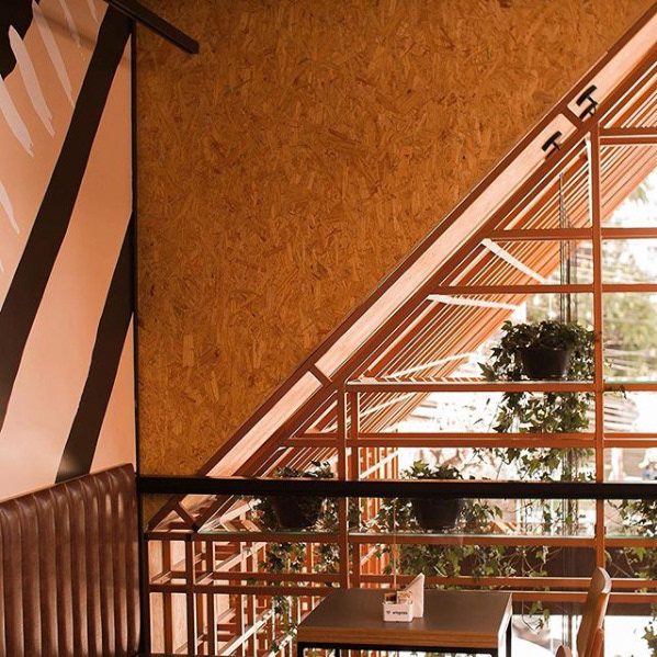
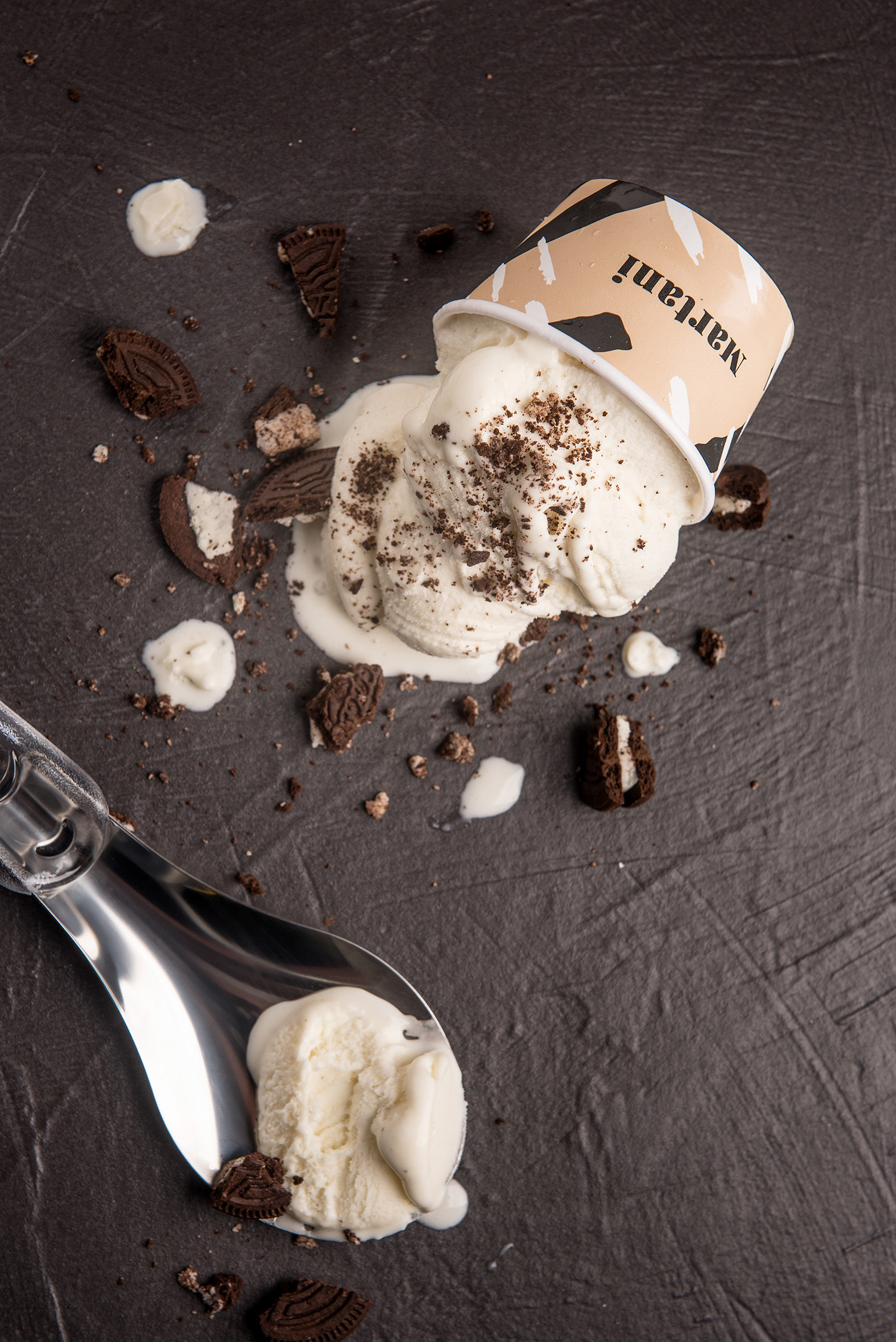
A Identidade visual da gelateria e cafeteria Martani tem como base um monograma desenhado a partir das iniciais dos fundadores, um “M” maiúsculo e “t” minúsculo, uma composição perfeita que representa a união da família responsável pela marca. O estúdio tomou o estilo artesanal do sorvete e usou-o como inspiração para o processo de design gráfico. Todos os elementos foram desenhados à mão, com carimbos, pincéis e até as pequenas pás de madeira que são usadas para degustar o sorvete.
Visual identity designed for Martani, an italian style ice cream parlor and coffee shop. The monogram designed brings together the initials of the founders, a capital “M” and a lowercase “t”, a seamless composition that represent the union of the family that run the brand. The studio took the artisan style of the ice cream itself and used it as an inspiration for the graphic design process. All the elements were draw by hand, with stamps, brushs and even the little wooden scoops that are classicaly used to taste the ice cream.